
So… What Does This Thing Actually Do?
When I started making this watch face, the plan was fairly simple.
Make my very own Garmin look a bit like the clock from Kingdom Come: Deliverance.
That was it.
A nice medieval dial. A few useful numbers. Perhaps a tasteful little icon here and there. I had seen some existing versions, but thought I could do one that’s better as the other ones looked very basic to say the least.
Naturally, this escalated. Way, way too much.
Several days later I was calculating the position of the sun, making tiny gemstones judge my physical wellbeing, deliberately trying to make a skull appear when my heart rate disappeared, and discovering a surprising number of ways to make a Garmin display the Connect IQ equivalent of “absolutely not”.
So, for anyone wondering what has actually made it into the watch face – and what was dragged behind the barn and quietly put out of its misery – here’s the story so far.
The Clock That Started All This
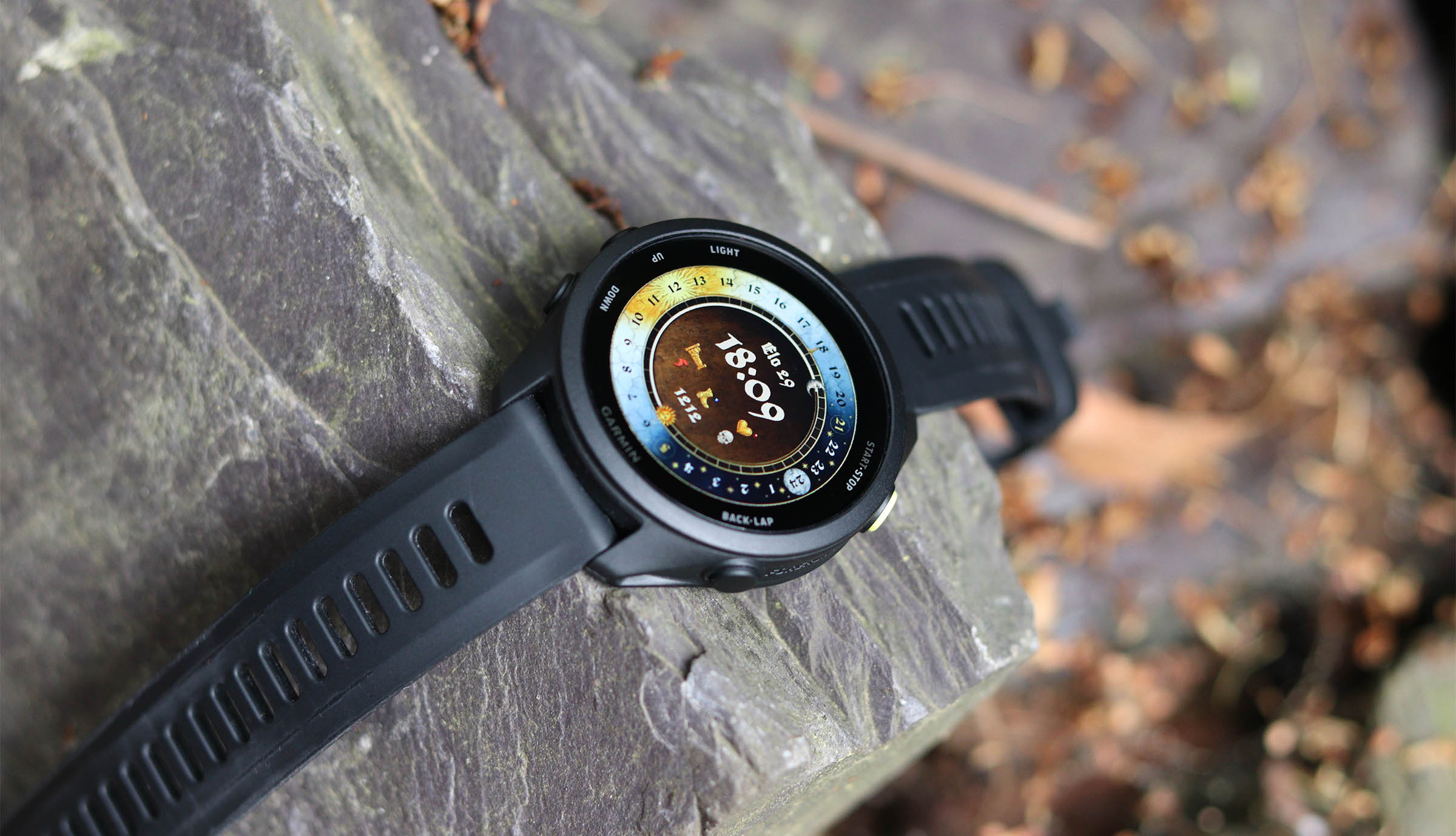
The main attraction is, obviously, the clock.
Rather than just sticking some medieval-looking hands on a normal digital watch face, I wanted something that actually felt like it belonged in KCD.
The result is a full rotating 24-hour sundial-style wheel, sitting inside the main dial. The wheel itself turns throughout the day while a fixed pointer at the top tells you roughly where you are in it.
It doesn’t replace the actual time display – I’m fond of medieval nonsense, but not sufficiently committed to start telling people I’ll meet them “somewhere shortly after the third cockcrow”.
The proper time is still there when you need it.
The dial uses the wonderful Maximilian-style typeface and a mixture of black, warm cream, gold and that slightly faded KCD blue, with Roman numerals and various bits of suitably unnecessary medieval ornamentation.
In other words, considerably more effort than was required to answer the question:
“What time is it?”
Then I Made the Sun Move
This is probably my favourite bit.
The watch gets Garmin’s sunrise and sunset information, which is based on your location, and uses it to position separate sunrise and sunset markers around the dial.
Between them sits a daylight arc, so the watch effectively shows you where today’s daylight falls around the 24-hour wheel.
And because sunrise and sunset change throughout the year, the whole thing shifts with them.
So in summer you get a gloriously long stretch of daylight.
In winter you get the traditional British experience of looking at your wrist and being informed that darkness has won (or whatever your local experience may be depending on where you are).
There are also deliberately simple sun and moon symbols at the ends. I originally tried more detailed ones, but there comes a point where lovingly drawing a tiny medieval face becomes rather pointless when Garmin eventually displays it at approximately the size of a bread crumb.
Simple won.
Eventually.
There was also a fun period where the sunrise marker simply refused to exist.
The calculations were fine. The sunset worked. The sunrise did not.
After quite a lot of staring at formulas and questioning my understanding of both Garmin and celestial mechanics, it turned out the PNG was the problem.
I had, effectively, spent part of an evening debugging the Sun.
Heart Rate, Now With Added Mortality
Heart rate gets the little KCD-style heart treatment.
Most of the time it’s simply your current heart rate, displayed in the normal warm off-white colour.
If your heart rate gets particularly high, it changes to red.
Nothing terribly revolutionary there.
But I also wanted something to appear when the watch couldn’t get a heart-rate reading.
The obvious answer was a skull.
Because of course it was.
Getting the skull to appear was considerably less obvious.
My first attempt was essentially:
“If heart rate doesn’t exist, show skull.”
Garmin’s response was approximately:
“No.”
Several increasingly creative variations of “but seriously, IS THERE A HEART RATE?” followed.
Eventually I got a working solution, so now when the relevant heart-rate data disappears, the watch can produce a little skull instead.
This is not medically useful.
It does, however, make me laugh. And if you happen to die whilst wearing this watch face… Someone might look at the watch and go “yup – he’s dead“.
Body Battery Becomes Slightly More Medieval
Body Battery is shown as one of the main stats, using the little bed/rest icon.
Originally that could quite easily have just been a number.
But then I started thinking about KCD’s buff and debuff system.
Which was a mistake.
Because this led to…
Buffs and Debuffs
Rather than covering the watch in even more numbers, I wanted it to occasionally give you a very simple visual hint about how you’re doing.
So I made tiny KCD-inspired gemstones.
A blue sapphire is a buff.
A red ruby is a debuff.
No gemstone means everything is fairly ordinary and Henry may continue about his business.
There are currently several things that can earn you one.
The Heart
The heart doesn’t just look at whether your heart is beating – which, admittedly, is an excellent start.
It also uses Garmin’s stress information.
If your stress is particularly low, you can get a blue buff.
If it’s particularly high, you get the red debuff.
So you can now glance at your wrist and discover that Garmin has officially diagnosed you with:
A Bit Rattled.
Rest and Recovery
The bed/rest indicator is slightly cleverer.
Rather than looking at Body Battery alone, it considers both Body Battery and Garmin’s Recovery Time.
If you’re well charged and properly recovered, you can receive the blue buff.
If your Body Battery is badly depleted, your recovery time is very long, or the two combine to suggest you’ve been treating yourself like a rented mule, you get the red one.
This was my attempt to make the indicator a little more meaningful than simply:
“Battery number low = bad.”
Walking Around Like a Responsible Medieval Peasant
Steps use a longer view rather than judging you purely on today.
The watch looks back across the previous three days and checks whether you hit your daily step goal.
Hit it on at least two of them?
Blue buff.
Miss it on all three?
Red debuff.
Hit it once?
Nothing.
You are neither hero nor villain.
You walked around a bit.
Originally I experimented with much more elaborate little buff/debuff symbols, wax seals and all sorts of other tiny decorative things.
They looked lovely while massively enlarged on a computer monitor.
At actual watch size they looked like someone had dropped a biscuit crumb onto the screen.
Hence the gemstones.
A sapphire and ruby remain recognisable even when they’re only around 10-20 pixels across, which is considerably more useful than a lovingly illustrated medieval seal that becomes “small brown blob”.
The Basic Useful Stuff Is Still There
Amongst all this nonsense, it is still supposed to be a usable watch face.
So you still get the things you’d reasonably expect to see without consulting the stars:
- Current time
- Date
- Heart rate
- Body Battery
- Daily steps
- Stress and recovery information working behind the buff system
- Location-aware sunrise and sunset
- The 24-hour sundial/day-night display
The important bit for me was keeping all of this feeling like part of the same design.
I didn’t want to make a beautiful KCD clock and then surround it with twelve brightly coloured Garmin widgets looking like they’d wandered in from a completely different century.
Things We Tried That Did Not Survive
There have been casualties.
The Compass
For a while I thought it would be rather brilliant to turn part of the dial into an actual compass.
Point yourself towards Sasau and off you go.
Unfortunately, a proper live compass doesn’t really fit nicely into what I’m building here in Watch Face Builder. It starts wandering into separate app/data-field territory and would add a fair amount of complexity for something that isn’t really central to the face.
So the compass was sent home.
Perhaps one day.
Glucose / CGM Support
This one got surprisingly far.
The idea was to make one of the fields configurable so people using things such as CGM/WatchDrip setups could potentially select glucose as a Garmin complication.
In theory, quite neat.
In practice, this involved configurable complications, .SET files, different device builds, and a prolonged period where my watch would simply display the little IQ! symbol and refuse to elaborate.
At one point I actually got the configurable field to load.
It proudly displayed:
%s
Progress!
Sort of.
Some of that turned out to be formatting. Some of it involved the custom font. Some combinations worked. Others caused the watch face to fall over again.
And because the whole point of this project is that you should be able to sideload the watch face and use it without performing a minor exorcism on your Garmin, I decided against it.
For now, at least, the watch uses Garmin-native data that can just work without extra configuration or external services.
This also keeps things much easier for me when I inevitably break something at 11pm.
Extremely Elaborate Tiny Icons
I have learned an important lesson during this project:
There is a significant difference between an icon looking simple at 800% zoom and an icon actually being simple.
Buff icons were one victim.
The sun and moon went through the same process.
Various ornate pointers and decorative pieces did too.
Every time, the cycle was roughly:
- Make lovely detailed KCD-inspired artwork.
- Put it on watch.
- Squint.
- Remove 70% of lovely detailed artwork.
- Put it on watch.
- Squint slightly less.
- Repeat.
It’s surprisingly difficult to produce something that feels appropriately medieval without accidentally creating a six-pixel smudge.
The Skull That Wouldn’t Die Because It Wouldn’t Live
This deserves a second mention purely because of how irritating it was.
The skull was supposed to appear when heart-rate data wasn’t available.
It didn’t.
I changed the visibility logic.
Still didn’t.
I separated it from the heart-rate text.
No.
I tested the condition in slightly different ways.
Absolutely not.
Meanwhile, the entirely separate high-heart-rate red colour worked perfectly, presumably just to taunt me.
Eventually another route worked and the skull finally appeared.
So one of the simplest-looking features on the entire watch face is also one of the ones that caused the most swearing.
Software development.
Why Not Just Make a Normal Watch Face?
An increasingly reasonable question.
But this is really why I’ve enjoyed making it.
None of this was supposed to become a “product”.
I wanted a KCD watch face because I love the games, I like tinkering with things, and the idea of having a tiny piece of that world on my wrist amused me.
Then I realised Garmin exposes sunrise and sunset.
Then I realised the sundial could actually move.
Then I wondered whether Body Battery could become a game stat.
Then apparently gemstones became involved.
And here we are.
I’m deliberately trying to keep the finished face on the right side of useful. I don’t want every available Garmin statistic squeezed into it simply because there’s technically somewhere I could put another number.
It should still look like a medieval clock first.
The clever bits can quietly do their thing underneath.
And when they can occasionally tell me I’ve earned a tiny blue sapphire for going for a walk, all the better.
Is It Finished?
Hahahaha.
No.
Well.
Probably.
Maybe.
The current version has reached the point where I’m actually wearing it and testing it properly rather than adding another feature every seventeen minutes. That’s usually a healthy sign.
There will almost certainly be small changes as I discover things that look wonderful on my monitor and ridiculous while standing outside trying to read the watch.
But the main idea is finally there:
A KCD-inspired medieval clock that happens to know about heart rate, recovery, stress, steps, sunrise, sunset and whether you’ve recently behaved well enough to deserve a small blue gemstone.
Which, when you put it like that, is exactly the sort of completely unnecessary thing I wanted to make in the first place.
And why was this post such a long-winded load of nonsense? I mean, why not?
JCBP!
Leave A Comment