
Testers Wanted – Buff System Rework
Latest Test Release Files (v.1.2.X):
- Garmin Forerunner 70 – Download
- Garmin Forerunner 970 – Download
- Garmin Venu 3S – Download
- Garmin Venu 4 – 45mm – Download
- Garmin vívoactive 6 – Download
Additional Updates – In addition to the new ‘Buff System’ (v.1.2.X):
- An alarm icon will now appear above the date, as long as you have at least one alarm set up on the watch
- The date format shown has been improved from showing just “Sep 04” – to “Fri 04 Sep”
- Hold-to-press link added for body battery
- Hold-to-press link added for steps
- Hold-to-press link added for heart rate
- Hold-to-press link added for calendar activities
- Implemented a ‘hotfix’ for special characters/glyphs to accommodate for these different languages. Now, these will revert to the “non special ones” now in languages like Czech rather than breaking completely – allowing you to use this version of the watch face in any language and it should work as long as the glyphs in use have a ‘normal’ equivalent available
- Adjusted the ‘warning red’ for HR and Body Battery to be less vibrant
- Adjusted the ‘leather’ background and it’s lighter and darker areas, to better compliment the contrast between the elements and make things a bit more visible
I’ve reworked the KCD Watch buff system and I’m looking for a few people to test it on real watches. (I know… I know… I have barely even released the watch to all models yet!!! 🤣)
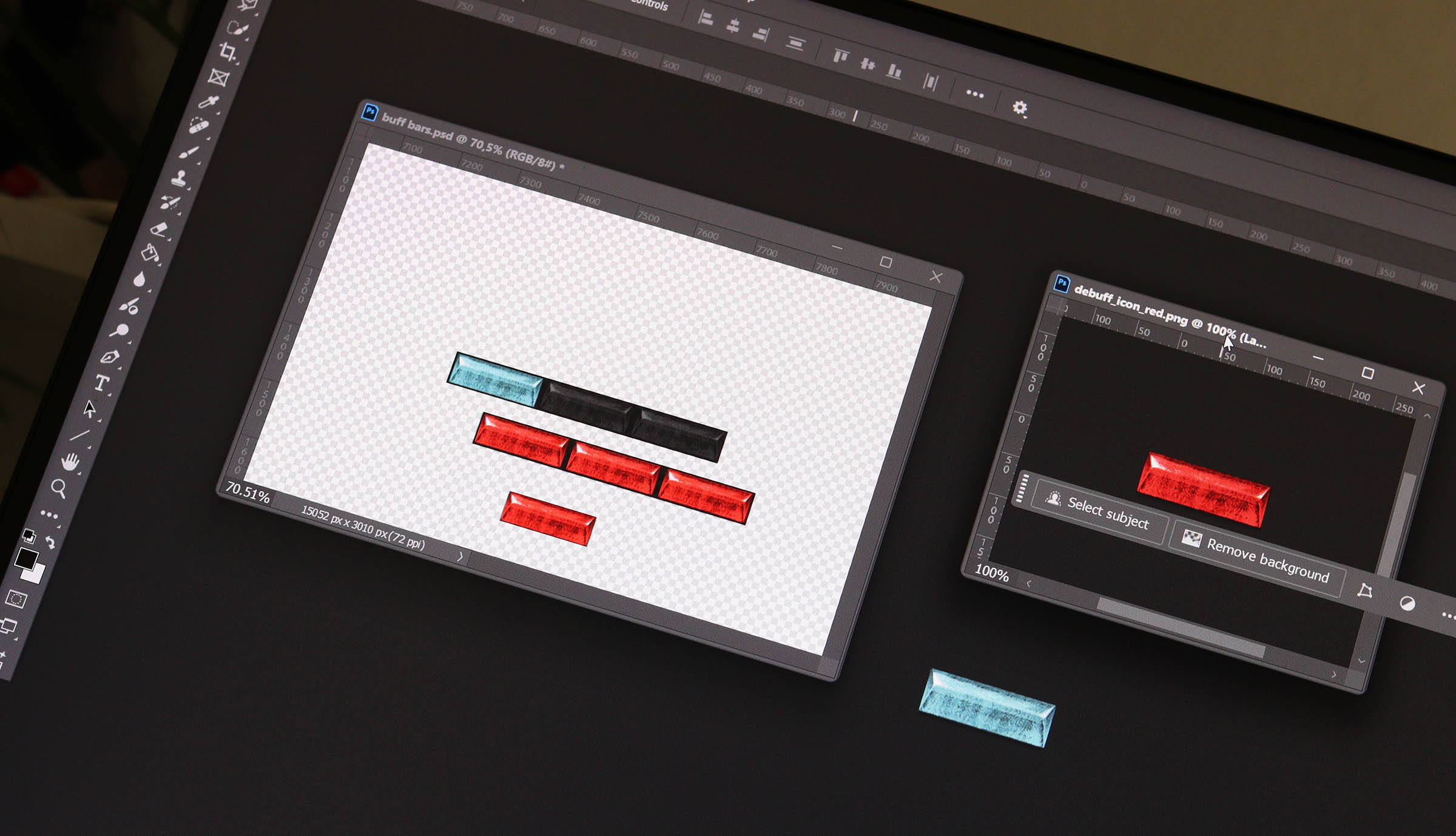
Instead of a single buff/debuff indicator (the current little round gems), Recovery, Activity and Stress now each have three small bars. They fill progressively depending on how strong the effect is:
- Blue = buff
- Red = debuff
- 1 bar = mild
- 2 bars = stronger
- 3 bars = extreme
The idea is to make the system feel less like a simple on/off switch and give a much better indication of how you’re actually doing throughout the day. Effectively, this means that we’re going from the previous the on/off state buff system with 3 states, to each having 7 states (1 off, 3 buff progressions, 3 debuff progressions)
I’m happy to prepare test builds for up to three different Garmin models.
All I ask in return is that you use it normally for about a week, then let me know how the new system feels in real use – whether the bars appear at sensible times, whether any thresholds feel too easy or too harsh, and whether the whole thing is actually useful at a glance.
If you’d like to test it, let me know which Garmin model you have below in the comments. Please ensure, you subscribe to notifications on the replies to your comment so you won’t miss out on any! (New Website Feature)
What Do the Buffs and Debuffs Mean?
Each of the three indicators looks at something slightly different. The number of illuminated bars shows how strong the current buff or debuff is.
Recovery
Blue recovery bars mean you’re well rested and ready to go, based on your Body Battery and remaining Recovery Time. More bars mean a stronger overall recovery state.
Red recovery bars act more like a warning. They appear when your energy is particularly low, Garmin thinks you still need significant recovery time, or a combination of the two suggests you could probably do with taking it easy. More red bars mean a more severe recovery deficit.
Activity
Blue activity bars reward you for getting active. They build progressively as you rack up more activity during the day, so the second and third bars represent going increasingly beyond the initial buff target.
Red activity bars appear when you’re falling well behind your expected progress for the day. They take both your steps and active minutes into account, with additional bars appearing the further behind you are.
Stress
Blue stress bars appear when Garmin is reporting particularly low physiological stress. The lower the stress level, the stronger the buff.
Red stress bars are deliberately reserved for unusually high stress readings. One bar indicates a very high level, while two or three bars are increasingly extreme states rather than something you should expect to see constantly.
The exact thresholds are still being tested, which is the main reason I’m looking for feedback from people using the new system in normal day-to-day life.
Please note: While I have done my very best to design the calculations so that they are generally helpful, and shouldn’t be too easy to achieve or alternatively the watch shouldn’t ‘complain’ too easily – these need real world testing to confirm they work as intended.
I won’t bore anyone with the exact formulas and calculations, but my aim was to have all the bars clear for the most of the time when everything’s “normal” – and then buff / debuff accordingly in a way that feels like the system its doing what it should be doing. And quite frankly, I think this information is best left undivulged so that the users can just focus on 3 buffs, or 3 debuffs around the concepts.
Some Visual Examples
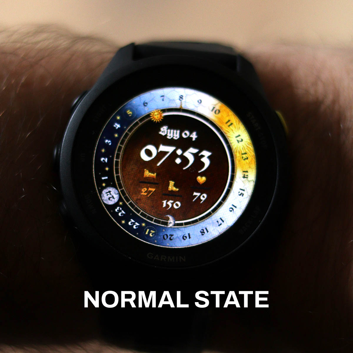
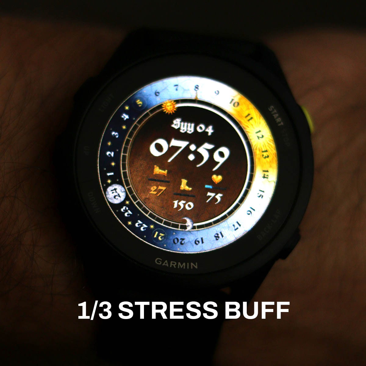
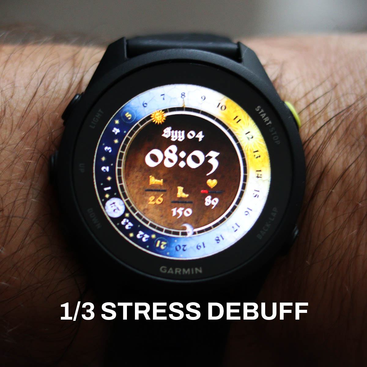
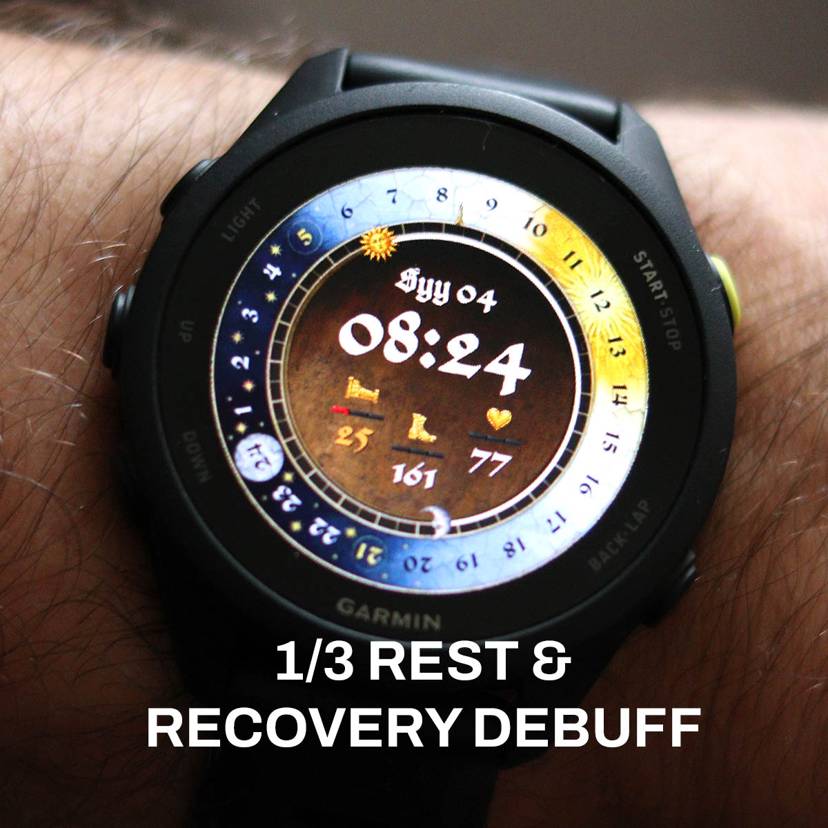
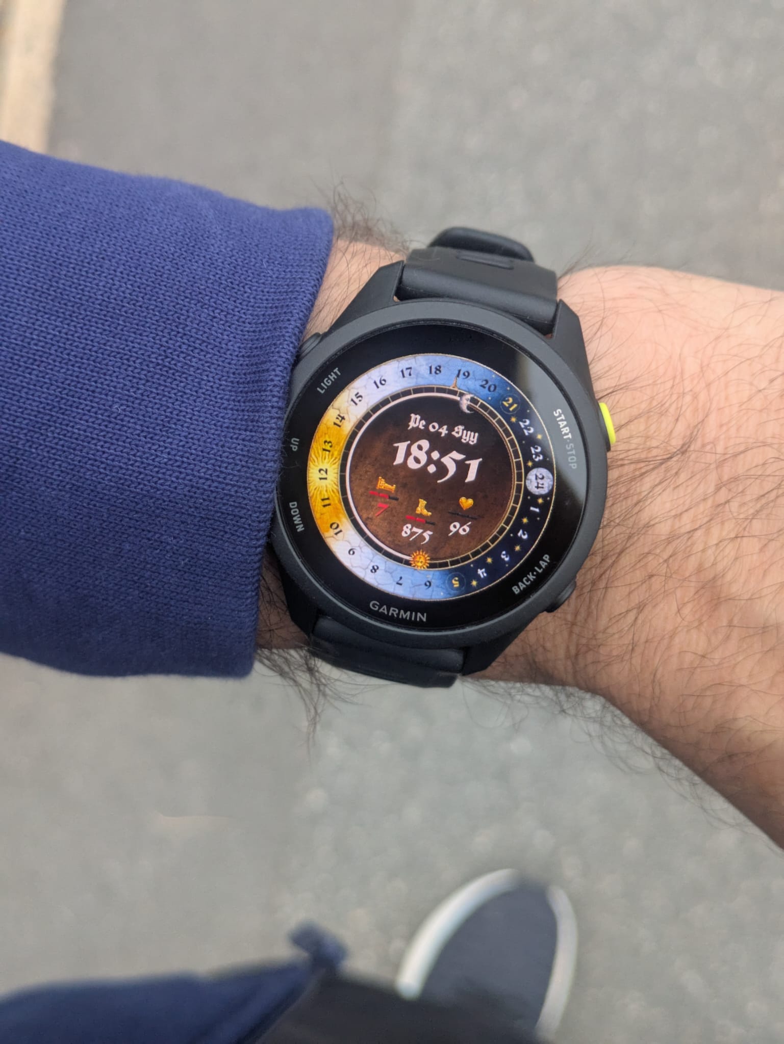
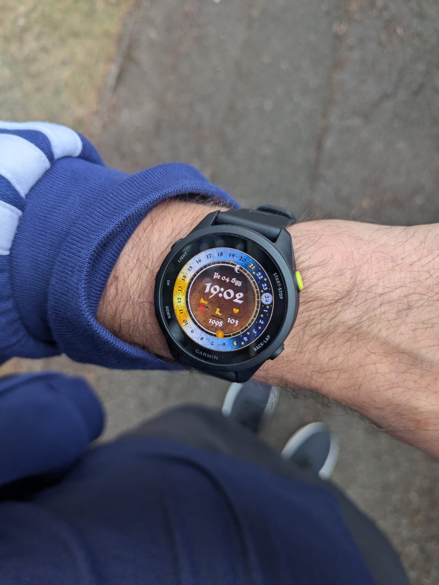
Hi all! I will get notified if someone messages here, so if you are interested in testing the watch – let me know by replying to this very comment.
Also: As the details of the buff bars are very intricate, I’d ask that if you wish to test this; that your watch face should be at least 390×390 or over in resolution. Ideally, it should be a watch already listed in the Compatibility List.
JCBP!
Ah just seen my Forerunner 255 is 260×260. But would be keen to test once you get to that level of resolution!
Yeah.. Sorry mate the smaller resolutions need a lot of extra work – and potentially leaving stuff out altogether. But, I’m sure I’ll get to it one day!
I’ll keep an eye out! JCBP!
I’d gladly test this, but my watch is not yet in the compability list. I have a Venu 3S which is 390×390.
That’s not an issue! As it’s the same resolution as my FR70 is, it’s relatively easy to do. 🙂 I’ll sort it out later tonight. Thanks!
Hi again! The Venu 3s test file can now be found on this page, or alternatively: https://kcdwatch.com/jcbp/releases/TEST/TEST-venu-3s.prg
Wonderful! I’ve installed it without issue so far. I’ll see how it performs over the week
Perfect, thank you! 🙂
I’m happy to try it out if you still need more testers. I’ve got a Venu 4 – 45mm
Perfect, thanks! 🙂 Venu 4 45mm is now available here: https://kcdwatch.com/jcbp/releases/TEST/TEST-venu-4-45mm.prg
Just a little update on my lunch break… My debuffs disappeared by the morning, but the rest one has come back already as I am not that well rested. Also, as I have been inactive the bar for that is starting to go up… And managed to snap a picture when the stress was under a certain threshold so at least I got a buff for that!
Another little update (with a poor picture, apologies!)
Added a very subtle but obvious icon, to signify if you actually have an alarm set up or not, increasing the utility of the watch. Additionally, improved the shown date layout – and added hold-to-push links to various endpoints on the watch.
Argh… Just noticed the inactivity debuff is not working properly. Or I think it is, but I need to change the numbers a bit to make it harsher. Updating the 2 links on this page in 10mins or so.
EDIT: Updated!
I’d be happy to try it on a FR970
Hey Brian! Thanks 🙂 I’ve just created it and added a link to this page as well (https://kcdwatch.com/jcbp/releases/TEST/TEST-forerunner-970.prg)
JCBP!
Just as a note for myself: I need to adjust the colours and especially the warning reds, to be more legible. And unify all gold graphcis.
The watch face is super cool! Im very satisfied with this update on my Venu 3S! The bars show up approximately when i expect them to and they are a fun dynamic indicator. The only thing I miss is a seconds counter, not sure how it would be implemented though 🙂
Thanks for the feedback! 🙂 I think that could actually be quite an easy thing to do… Both a small indicator or a bar that follows around the sundial, but also a smaller second in numbers just for example right of the larger HH:MM…. Will test around and see if I can make something without making it look messy or too cluttered!
JCBP
Hey so I have some initial feedback on the new features.
First off I think most of the changes are really good. Having the day as part of the date format is great and the hold-to-push links have been very useful, especially the one to my calendar. I was surprised at how much I’ve been using that.
One thing I didn’t really like is the little alarm icon. Personally I didn’t find it useful since I always have several alarms set so it’s not really indicating anything to me. I can imagine it’s useful if you’re the kind of person to only have one alarm set occasionally, but that’s not me. As such it just feels like a bit of visual clutter that’s taking space from the date text or just the general cleanliness of the watchface design. Perhaps there could be a setting as part of the face to turn it on or off so people can choose for themselves.
On the buff/debuff system, I think the tiered bars are definitely superior to the little gem markers, so this is a great improvement. One thing that was a slight issue for me (and I’m not really sure that there’s anything to be done about this) is that although the buffs are thematically matched to each of the metrics they’re under, they don’t necessarily relate to them directly. So I found myself coming back here to double check their meanings a couple times in the first few days. That might just be a normal learning curve for this watchface though.
Regarding the calibrations of the levels, I think they’re fairly appropriate. I found that I was usually 2-3 red bars on the recovery one which makes sense since I always struggle with that. The activity one would definitely start to show up on my wfh days with my reduced step count until I went out to do some physical activity and it switched to blue levels. The only one I didn’t see much of was the stress related one. I would occasionally see a single red or blue bar but most of the time it was neutral, which I do think largely reflects my experience. So again, I would say I’m pretty happy with the tuning.
My only suggestion would be based on your description of using recovery time and body battery as the metrics for the recovery buff/debuff. I think it might make more sense to use training readiness instead of recovery time, since it’s a more comprehensive metric, but that may reduce the portability of the watchface since I don’t know if this exists in all the garmin watches.
Oh and +1 on the seconds counter please 🙏.
Anyway, sorry for the wall of text. I think those are all my thoughts for now.
Overall, great upgrade, and keep up the good work!
Hey!
First of all, from another wall-of-text-connoisseur to another: That is excellent feedback! Thank you so much for taking the time to test the watch face, and the report on it in the way you’ve done. That is super helpful. And with feedback like that, the watch face will be as good as it can be eventually. 🙂 (One would hope!)
I’ll address different parts in my own wall of text / pointers here below! Apologies for the format + possibly typos, but I’ll just try to answer as quickly as possible before heading off to the office for the day.
– I think you raised a very good point about the alarm icon. It was actually something that someone emailed me about and at the time I thought it made sense (as someone who never / rarely has an alarm set so there’s more utility to me or ‘our kind of people’) – but as you pointed out it’s a bit pointless if you have an alarm or 10 set up all the time. And then it just becomes clutter. And this is an important point that I will keep in mind going forward, as the watch face (currently) lacks the customisation or preference options to be set by the user – everything that’s going to be ‘hard-baked’ into the watch face needs to work for everyone. Or anything that will be included as a ‘base feature’ in other words going forward.
– With the above point in mind, as I’ve been thinking about a battery indicator as well… I think while it does make sense and has utility, I should do it in such a way that it only shows when it’s time to charge. And not, “Your battery is at 90.. 94… 100%”. As, who really cares? Like where’s the utility in that? e.g. maybe a very subtle amber icon when under 30% for example – and then when under 10% it turns red… As most decent Garmins last for more than a week (we didn’t buy Apple Watches for a reason!), so that should give plenty of time to charge… You know, utility – over clutter. 🙂
– Though, I think I should be eventually able to do some kind of a customisation option – or an easy to use ‘toggle’ to cycle through certain modes of the watch face for example. But as this is such a long-winded project and progress takes time, I need to finish the base watch first.
– To wrap this point up: If and when I get individual points and requests, I need to make sure that they are indeed for the greater good, and not for the sake of an individual’s own preference.
– I already have and will continue to struggle to keep everything clear and clean, and any pointless addition that might be considered to be clutter needs to have its existence scrutinised accordingly.
– As for the buffs / debuffs: That’s good to hear that it’s going the right way, and I have indeed struggled with what metrics I can use and how I can use them reliably in the calculations as Garmin exposes only so many things (and only so many things of them work well and claim to be available on most watches…) I’ll definitely review what they’re linked to and see how I could improve them – or with the addition of toggles / options I might be able to make them a bit more unified
I think out of the buff/debuffs, the one that I’m very happy about personally, and it seemed to work for you, was the activity one.
But I do need to ask: When you say you got the blue activity buff, what did you do exactly? And most importantly: Did you have a tracked activity running? Like “walking / running” – or was it just physical activity as interpreted by the watch? As this is one of those annoying Garmin things where it claims to have “activity minutes” or “intensity minutes” – but depending on what mode your watch is in, what watch it is – it may or it may not trigger it. And I’ve struggled with that myself when testing it.
Basically the way I’ve done the activity (and why I’m happy with it), is that it’s tied to both steps and activity. If you fall behind on either, you will get the debuff – and there’s a small safety buffer baked in that it won’t start complaining before 12:00. (As to me it’d be annoying if you wake up in the morning and your watch is already complaining!) And you can relatively easily clear it by just walking, or you can clear it very quickly by activity minutes. And currently you can only get the blue bars on it by getting activity minutes in. Meaning: The watch will stop complaining about your activity as long as you move a tiny bit, but if you want to be rewarded, you better be ACTIVE. And as both are tied to the daily steps target and the daily portion of your weekly activity minute target, if yours change – the buff behaviour changes with it.
Aaaaaaaaaaaaand I’m just rambling on now… I need to dash now, but to recap:
– Great feedback
– Will keep clutter to minimum
– Utility and design over everything
– Hopefully customisation options / toggles soon
JCBP!
Hey, so to clarify my experience with the activity buff, what you’ve said makes total sense in terms of what I’ve seen. I’ve never managed to get the blue buff simply by walking, even when exceeding my daily step goal by 20-30%. But it does come quickly from tracked activities which is what occurred in the situation I described above. I like the way you’ve phrased it as you can keep it at baseline by walking, but you need to be active or do something beyond the status quo in order to get the “reward” signal. I guess I just need to realise I’m not actually in a game and it’s okay for me to not have the buff at maximum all the time lol.
Plus a thought on the battery indicator: I’m not sure it’s necessary but if you do find a good spot for it (perhaps where the alarm icon is now/next to it) maybe you could use the reputation faces as the indicators. They certainly fit thematically.
Actually it just occurred to me looking at the watch, the sun icon for sunrise time already has a face. What if you replaced that face dynamically with the reputation faces as the battery indicator, then it wouldn’t take any more space and it’s still relatively subtle, but remains visible. You’d have to make like 5 different versions of the sun icon though. I may be getting a little caught up in this idea all of a sudden but just some food for thought.
Thanks for the comment(s) once again! I think I definitely need a swipe / toggle involved to be able to free up space and then just clear the clutter. Also, with watches like yours you actually have a bit more space to play with (454×454). I’m building this on a 390×390 which is a bit more constrained – and then I need to always move things around when porting for larger resolutions (possibly giving an illusion of ‘more available space’). I think eventually when “my version” is complete and all’s working really well – I can then make better use of the larger resolution space. But for the time being, I need to focus on the 390×390 and do the larger resolutions with just minor positioning adjustments.
That’s a good suggestion re the battery! Annoyingly, when using images like the sundial, the moon, the sun – and having these effectively as rotating hands… Each image gets multiplied 60 times, as the watch doesn’t genuinely rotate the images smoothly as this would be super intensive for the watch’s processor / power use as calculating kind of angular changes on the fly on complex bitmaps would be a bit… Much I believe. But rather, the watch just changes a pre-rendered image to create the illusion of rotation, and this effectively is the reason why there’s a small jump in the sundial already as it is (360 deg / 60 = 6 deg – or in other words for the sundial specifically: A jump every 24 minutes as there are 1440 minutes in a day). And as Garmin has a hard limit of approx 255 pictures I believe, I need to be super careful with these rotating assets.
I’m currently at:
11 normal/static images
60 × sundial ring
60 × sun
60 × moon
= 191 / 255-ish
I am planning to reduce the amount of image assets (eventually) only to a single rotating one (the sundial graphic), and then create SVG graphics for simpler things like the moon and the sun. But this also defines how realistic / good looking the little icons can be that rotate. Though, I should be able to create these with a combination of a few different coloured SVGs to give the illusion of detail, shadows, etc. I think I also need to separate the 24 numbers from the sun dial itself so that the only ‘somewhat jumpy’ (6 degrees) effect is observed on the general day / night colouring of the sundial, but as the numbers would be a SVG dial on top of that… That should hopefully make the number spin in an accurate way too.
And always happy to hear / discuss ideas! Even though some may or may not be possible.
JCBP! 🙂
Just a small update: I have successfully created a ‘toggle’, which means that you can basically press on a defined area of the watch and then this toggles through different states.
For example, as an initial test I did 4 stages for the time and by pressing on the numbers shown you can toggle between:
State 1: 24h time format
State 2: 12h time format
State 3: 24h time format with running seconds
State 4: 12h time format with running seconds
Also, as these states have their own values, you could do this with a combination of a few things very simply. So, by having two things with 4 states, you would realistically get a combination of 16 different ‘toggle state options’ as these multiply. Or by having 3 different things toggle through 4 states, 64 states, etc.
Now, while this is great and super useful, it also creates way too many opportunities to do things!!!!!!!!!!!!! 🙂
I will put my thinking hat on for a few days with this confirmed functionality. As this obviously means I could have a few views to the real watch made quite easily. (With buffs, without buffs, with buffs and notification icons, with and without, and maybe even special ‘glance’ views or tabs that you can toggle on and off: Like more detailed view on all stats)
JCBP!
And another one!
After playing around with the toggles, I ran into the problem that there probably will be lots of different settings different users would like to change, so I thought I’d see if I can basically build a menu that opens conditionally, and then the hitboxes of certain toggles or settings work only conditionally if the said menu with its items is currently visible… And it works!!!!!! JCBP
Also, I’ve verified with app settings that if you set the watch settings from the custom menu (as in the global variables in use) – I can use Garmin’s own app storage to keep the selected settings. So, even if the watch face would end up with 20 different toggles eventually, it’ll always remember what state the watch was in even if you were to turn the watch off momentarily, or if it were to crash. Heck, even the menus are fixed global variables, so it would keep the menu open on the exact page that you had open when the watch last was in use and running!
And by having the actual settings or changes hidden in a conditional menu, we can actually use the available watch space for the links like the “calendar events” – rather than just change how the watch looks by poking at individual elements.
Initial thoughts for menus / setting toggles that I would do with icons to account for multilingual side of the watch, keeping each setting page limited to 3 setting toggles – for easy use. (As I need space for the “close menu” and “toggle menu pages” as well)
Page 1:
– Complex vs Simple Watch mode (i.e. – with or without the stats / buffs / etc)
– Time format 24h vs 12h
– Seconds OFF vs ON
Page 2:
– Alarm Notification Icon OFF vs ON
– TBC
– TBC
And eventually… Maybe different sets of stats shown or combination of stats shown – as different ones may be more important for others…
This is getting rather complicated.
JCBP! 🙂
I’m liking the sound of this, definitely better as a strategy for dealing with customisation. Looking forward to trying out these options eventually.
Thanks! Though, I do feel like I just had a “2 steps forward, 10 steps back” moment… The “long press” toggles weren’t really made for this, so whilst the menu idea does actually work and function – now that it has a fair bit of complexity to it… It’s really annoying to use because the watch falls asleep. So to be able to change the settings on something that’s on page 2 for example, you’d probably need to let the watch fall asleep 2-3 times whilst clicking through the menu.
So, I’m not sure if I can force the watch to stay on when menu is in use somehow…. If not, I may have to do ‘area toggles’ after all.
There is some kind of a native Garmin menu option as well, or the possibility of using .SET files (which I’m trying to avoid as sideloading a .PRG is just so quick and easy to do)…
… To be continued. 🙂 I will have some customisation available one way or another for the next test version / release!
Oh, and I almost forgot: JCBP!
Small update: I have been using a simplified version where I can just toggle the time format by pressing on it, and while it does work… I’ve noticed during the week that it’s changed on its own almost every day for me. Possibly when the watch wakes up, and just accidentally gets pressed or it think it’s being pressed… And this is to say the least, annoying. And if I were to have 5 other setting areas that I can change, then it’s even more annoying.
And it dawned upon me that the following is probably the best implementation:
– No special menus as that are laggy / buggy / clunky
– But instead a small special area dedicated for activating the a “Settings Mode Armed / whatever mode”
– Once this settings area is pressed, a small “cog” appears signifying that you can now toggle any of the visible settings
– The toggling will be a bit guarded and clunky own its own merit – but should be a lot harder to accidentally alter any of the toggles
– And equally, when the settings mode is not activated, the cog is not visible. So no clutter, and you know you’re not changing any settings by pressing on the watch face.
– And if the cog is not visible / settings mode isn’t “armed” …. Nothing happens when you click on the other things like the time.
– Alternatively, this still allows us to use other links like Calendar Events for the time area, which would just change its functionality once the settings mode is activated.
– No clunky and laggy menus, easy toggle, but only when the “mode” is activated
I think I’ve done enough for a new version to be pushed out, so I will just polish the current version – and do that as a wider release for everyone as per the compatibility page / confirmed models.
…. JCBP!